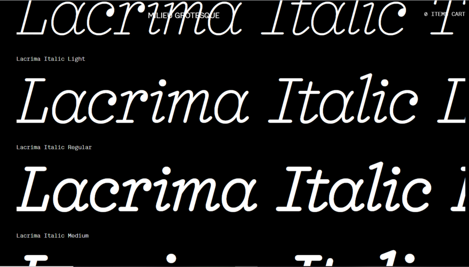
Milieu Grotesque is an independent Portugal-based digital type foundry best known for their typeface, Maison Neue ("Maison" meaning "Home" in French). In 2010, the studio was founded by Timo Gaessner and Alexander Colby, who both practice graphic and type design. Their focus lies in providing typefaces with the highest of design flexibility, resulting in a small yet refined library which is being expanded and updated.[1]
Chapeau(2010) Chapeau Type Specimen on the Milieu Grotesque Website.
Boutique (Didone-style typeface with slightly rounded letterforms)
Brezel GrotesqueBrezel Grotesk is a low-contrast sans serif originally designed by Stefanie Preis, with inward curling letterforms that are cheekily intended to mimic German pretzels[2].
GenerikaGenerika was designed by co-founder Alexander Colby, features subtle rounded corners, and was inspired by typewriters[3]
Maison Maison (Mono and Regular) was originally made for the corporate identity of Thomas Bendel Architect, a Berlin architecture firm. The typeface attemps to bring an indusrial feel through stiff letterforms. It was designed by Timo Gaessner[5], and publicly released in 2010, with a revised version published in 8 years later[6]).
Maison Neue Maison Neue, which was designed in 2012 by co-founder Timo Gaessner, is the sister family of Maison, with the visible difference lying inside the optical corrections and less rigid structure. Besides that, an extended style and monospaced style was added to the existing family.
Designed by Timo Gaessner in 2014, this typeface blends the two different styles of German type designer Günther Gerhard Lange and French typographer Roger Excoffon together to form a modern interpretation of the classic grotesque. The typeface has a large x-height, and low-contrast glyphs.


 Designed by Timo Gaessner in 2014, this typeface blends the two different styles of German type designer Günther Gerhard Lange and French typographer Roger Excoffon together to form a modern interpretation of the classic grotesque. The typeface has a large x-height, and low-contrast glyphs.